Consistent components from design to code
PRIMARY ROLE
Senior product designer
SCOPE
Design audit
Component structure
GOAL
Align design files and remove developer handoff friction
Fixing the handoff before it reaches the devs
Working across e-commerce, cart, and CRM platforms led to scattered design files and local variations. Because foundational details like fonts, colors, margins, and sizing were being redrawn across different projects, developers faced conflicting specs when building shared components.
I audited the existing files to identify where these handoff gaps occurred. The goal was to establish a single, shared source of truth that would remove ambiguity for engineering and bring consistency to daily production.


Centralizing libraries and streamlining team workflow
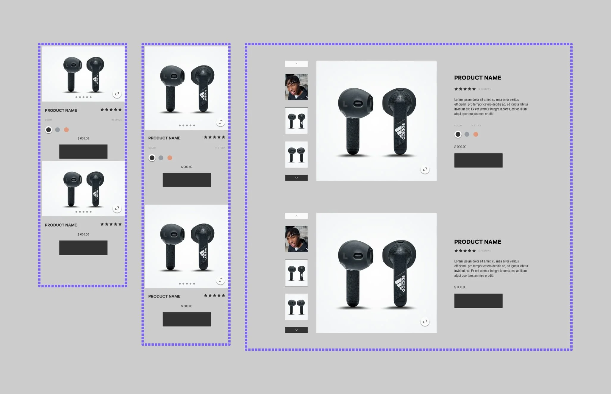
I rebuilt the core UI elements in Figma and organized them into accessible libraries, establishing clear global styles for typography, color, and grid systems.
Centralizing the e-commerce, cart, and CRM assets eliminated duplicate work and ensured that both designers and developers were referencing the exact same specs. This structural cleanup gave the team a reliable foundation, allowing everyone to build faster, reduce QA back and forth, and maintain alignment across projects.